In today's digital landscape, a well-designed landing page can make or break your online presence. Whether you're promoting a product, service, or simply trying to capture leads, mastering the art of UI/UX landing page design is crucial. This guide will walk you through the essentials of creating impactful landing pages that not only look great but also deliver results.
Understanding UI/UX in Landing Page Design
Before diving into the design process, it's important to understand the difference between UI (User Interface) and UX (User Experience):
- UI focuses on the visual elements of the page, including layout, colors, typography, and overall aesthetics.
- UX deals with how users interact with the page, including navigation, functionality, and overall user satisfaction.
A successful landing page seamlessly blends both UI and UX to create a visually appealing and user-friendly experience that guides visitors towards a desired action.
Key Elements of an Effective Landing Page
1. Clear and Compelling Headline
Your headline is the first thing visitors see, so make it count. It should clearly communicate your value proposition and entice users to explore further. Keep it concise, benefit-driven, and aligned with your target audience's needs.
2. Engaging Subheadline
Use a subheadline to provide additional context or elaborate on your main headline. This is your chance to further explain your offer and convince visitors to keep reading.
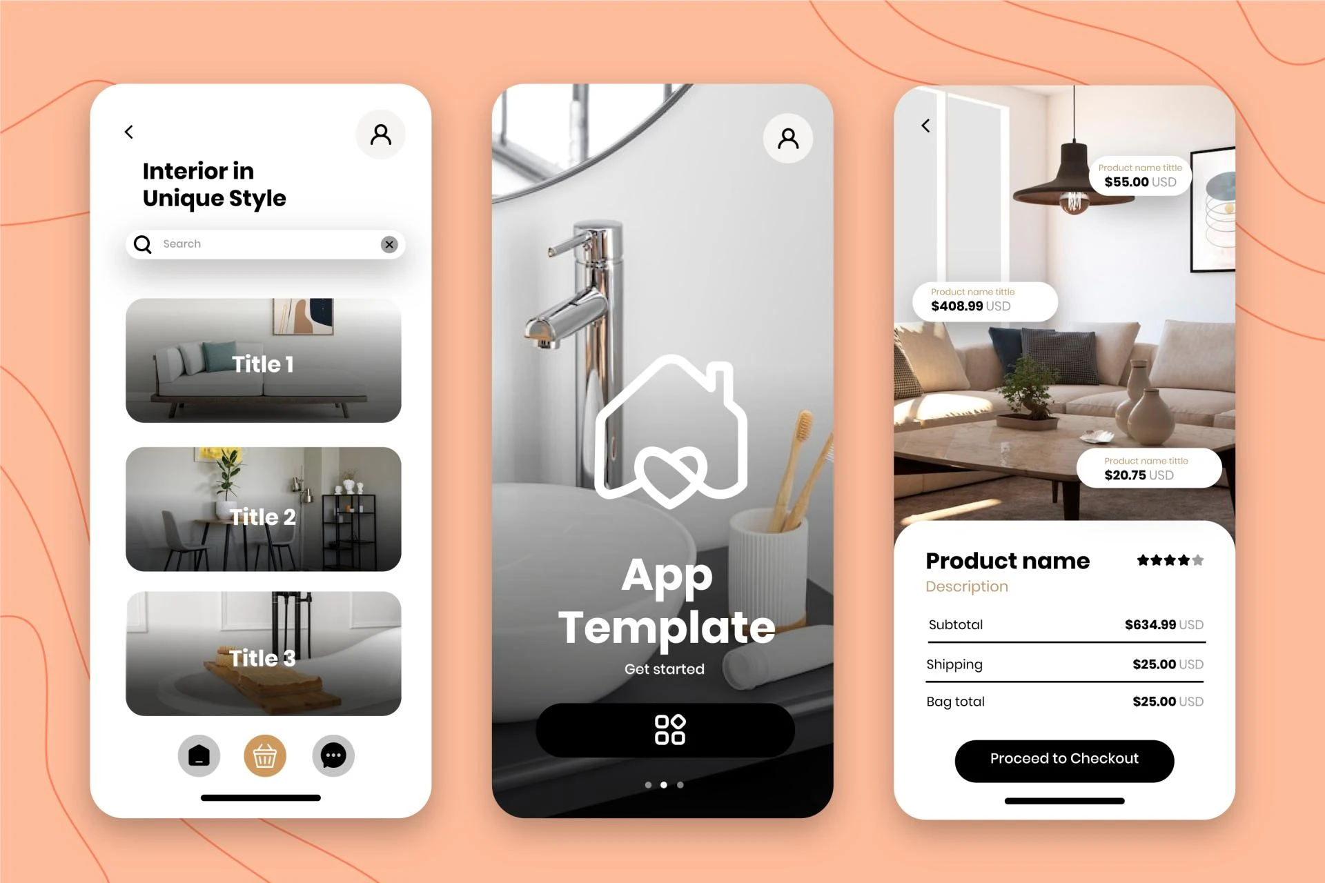
3. Hero Image or Video
Include a high-quality, relevant image or video that supports your message and captures attention. Visuals can significantly impact user engagement and help convey your message more effectively.
4. Concise and Persuasive Copy
Keep your copy focused and easy to scan. Use short paragraphs, bullet points, and clear headings to break up text. Highlight key benefits and address potential pain points your product or service solves.
5. Strong Call-to-Action (CTA)
Your CTA is the primary goal of your landing page. Make it stand out with contrasting colors, clear and action-oriented text (e.g., "Get Started," "Sign Up Now"), and strategic placement above the fold and throughout the page.
Designing Your Landing Page: A Step-by-Step Approach
Step 1: Define Your Goal
Before you start designing, clearly define the primary objective of your landing page. Are you trying to generate leads, sell a product, or promote an event? Your goal will inform every design decision you make.
Step 2: Know Your Audience
Research your target audience to understand their needs, preferences, and pain points. This information will help you create a design and message that resonates with them.
Step 3: Create a Wireframe
Start with a basic layout sketch or wireframe to plan the structure of your page. This helps you organize content and visualize the user flow before getting into the details of design.
Step 4: Develop Your Visual Hierarchy
Arrange elements in order of importance, guiding the user's eye through the page. Use size, color, contrast, and whitespace to emphasize key elements and create a clear visual path to your CTA.
Step 5: Choose Your Color Scheme
Select colors that align with your brand and evoke the right emotions. Use color psychology to your advantage, but keep it simple with a primary color, a secondary color, and an accent color for your CTA.
UI/UX Best Practices for Landing Pages
Keep it Simple: Avoid clutter and focus on essential elements that support your main goal. Use Whitespace: Give your design room to breathe, making it easier for users to focus on important elements. Ensure Consistency: Maintain consistent branding, colors, and messaging throughout the page. Create a Clear Visual Hierarchy: Guide users through your content using size, color, and positioning. Use Directional Cues: Employ visual elements like arrows or photos of people looking towards your CTA to direct attention.Common Mistakes to Avoid
Overcomplicating the Design: Don't overwhelm visitors with too many elements or options. Neglecting Mobile Users: Always design with mobile responsiveness in mind. Weak or Unclear CTAs: Make your call-to-action prominent and compelling. Slow Page Load Times: Optimize for speed to prevent user frustration and abandonment. Lack of Trust Signals: Incorporate elements that build credibility and trust with your audience. Misaligned Messaging: Ensure your landing page content matches the expectations set by your ads or links leading to it.Conclusion
Creating an effective UI/UX landing page design requires a blend of creativity, strategy, and user-centric thinking. By focusing on clear messaging, compelling visuals, and intuitive user experience, you can create landing pages that not only look great but also drive conversions. Remember, the key to success lies in continuous testing and optimization. Start with these fundamentals, and don't be afraid to experiment and refine your approach based on user feedback and performance data. With practice and persistence, you'll be creating impactful landing pages that achieve your business goals in no time.
My Fiver link for : Figma Landing Page Design Service


Sign in to leave a comment.