Business cards remain a powerful branding tool in a world dominated by digital networking. This article outlines how to select a business card that reflects your brand identity with precision. You’ll discover the importance of material, colour, typography, and finishes—and how they align with your audience and industry. Learn how to design a business card that’s functional, attractive, and memorable, without overwhelming your prospects. This guide will help you turn a simple card into a strategic asset for brand growth.
Understanding the Role of Business Cards in Branding
Your business card does more than pass along contact details—it introduces your brand’s values and personality in a physical form.
First Impressions Matter
The first interaction a prospect has with your card sets the tone for how they perceive your brand.
- Tactile connection: A high-quality card creates a sensory experience that digital communication cannot. Thicker paper or textured finishes add sophistication.
- Judgement in seconds: A study by Statistic Brain shows 72% of people form opinions based on business card quality, emphasising the role of card design in creating lasting impressions.
Business Cards as Brand Ambassadors
A business card is often the first branded material someone sees. It must align with your brand voice, aesthetic, and message.
- Reflect brand values: Colour, typography, and material choices should align with how you want to be seen—premium, eco-friendly, innovative, or traditional.
- Convey professionalism: Inconsistencies in design or poor printing create mistrust and reduce your brand’s credibility.
Define Your Brand Before Designing
Before starting the design process, it’s essential to understand who you are as a brand and who your audience is.
Clarify Your Brand Identity
Ensure your card echoes your broader branding strategy.
- Use consistent visual elements: logos, brand colours (in HEX or CMYK), and fonts.
- Match tone: A playful brand may opt for rounded fonts and bold colours, while a legal firm may choose muted tones and clean lines.
Target Audience Consideration
Design your card with the recipient in mind.
- A creative freelancer might use a vertical layout with bold graphics.
- A finance consultant may prefer a horizontal layout with minimal colours and clean typography.
- Consider how your audience receives and uses business cards—functionality is key.
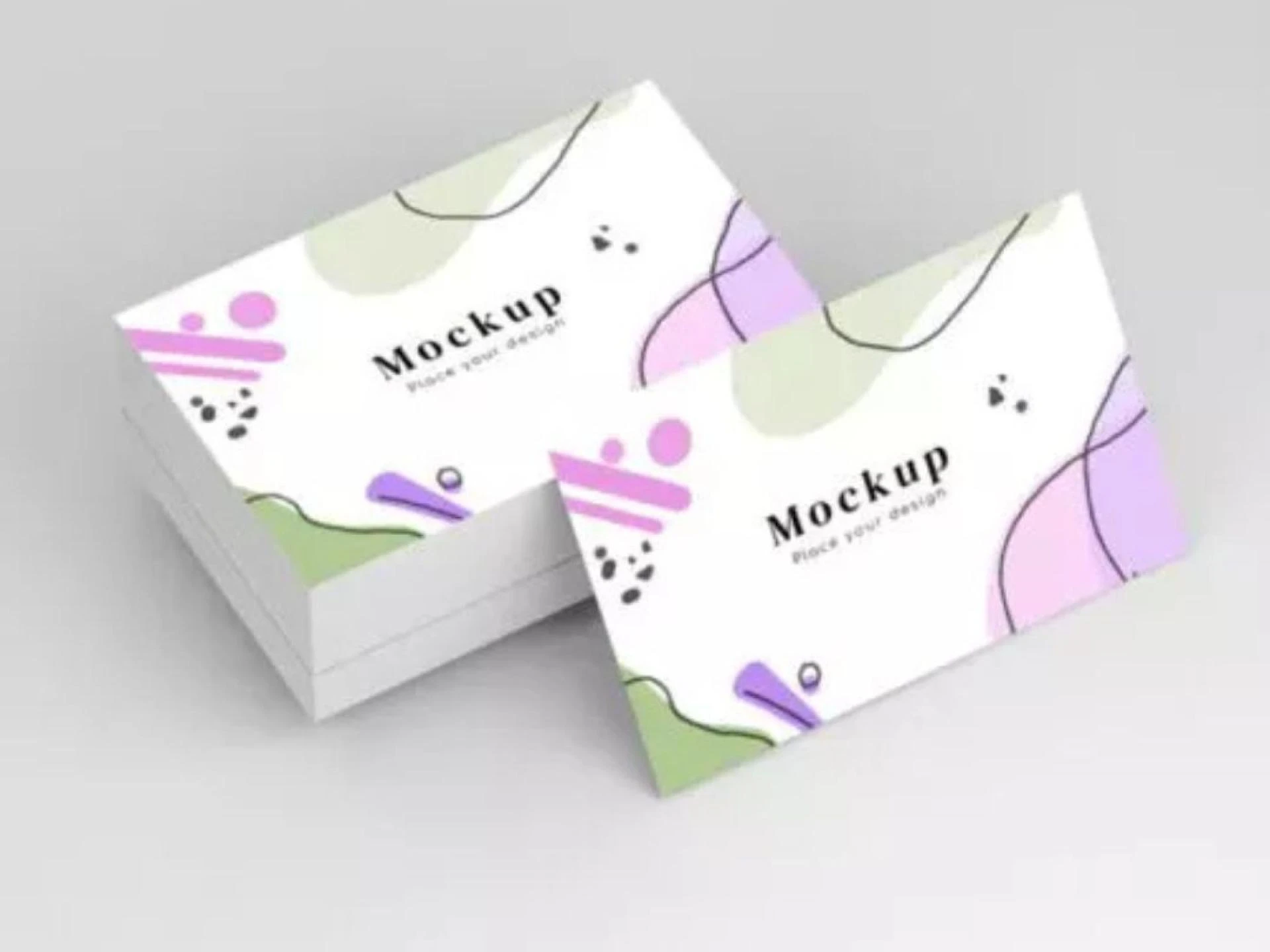
Key Design Elements of Business Cards
A business card should be simple, brand-focused, and visually structured for clarity and impact.
Card Size and Shape Options
Size and shape influence usability and memorability.
- Standard UK size: 85mm x 55mm fits easily in wallets and card holders.
- Alternative shapes: Square or die-cut cards stand out but must remain practical. Too unconventional may lead to cards being discarded.
Typography and Readability
Text should be clear and easy to follow, even at a glance.
- Font pairing: Stick to one or two typefaces for readability. Use bold or size variation for hierarchy.
- Whitespace: Don’t crowd the design. Proper spacing improves visual flow and prevents confusion.
Colour and Brand Consistency
Colours should align with your existing brand palette to reinforce recognition.
- Strategic colour use: Blue builds trust, red grabs attention, and green reflects sustainability.
- Contrast and readability: Light text on dark backgrounds (or vice versa) ensures clarity. Avoid colour combinations that strain the eyes.
Choosing the Right Materials and Finishes
The physical feel of your card sends a subconscious message about your brand quality.
Paper Stock Options
Your material choice influences how professional or premium the card feels.
- Matte stock: Offers a clean, modern look without glare.
- Gloss finish: Enhances colour vibrancy, ideal for graphic-heavy cards.
- Recycled paper: Shows environmental responsibility without compromising design.
Finishing Touches
Special finishes can enhance the design but should be used purposefully.
- Foil stamping: Adds a metallic accent, often used for luxury branding.
- Embossing: Raises specific elements for tactile interest.
- Spot UV: Highlights sections with a glossy contrast against a matte background.
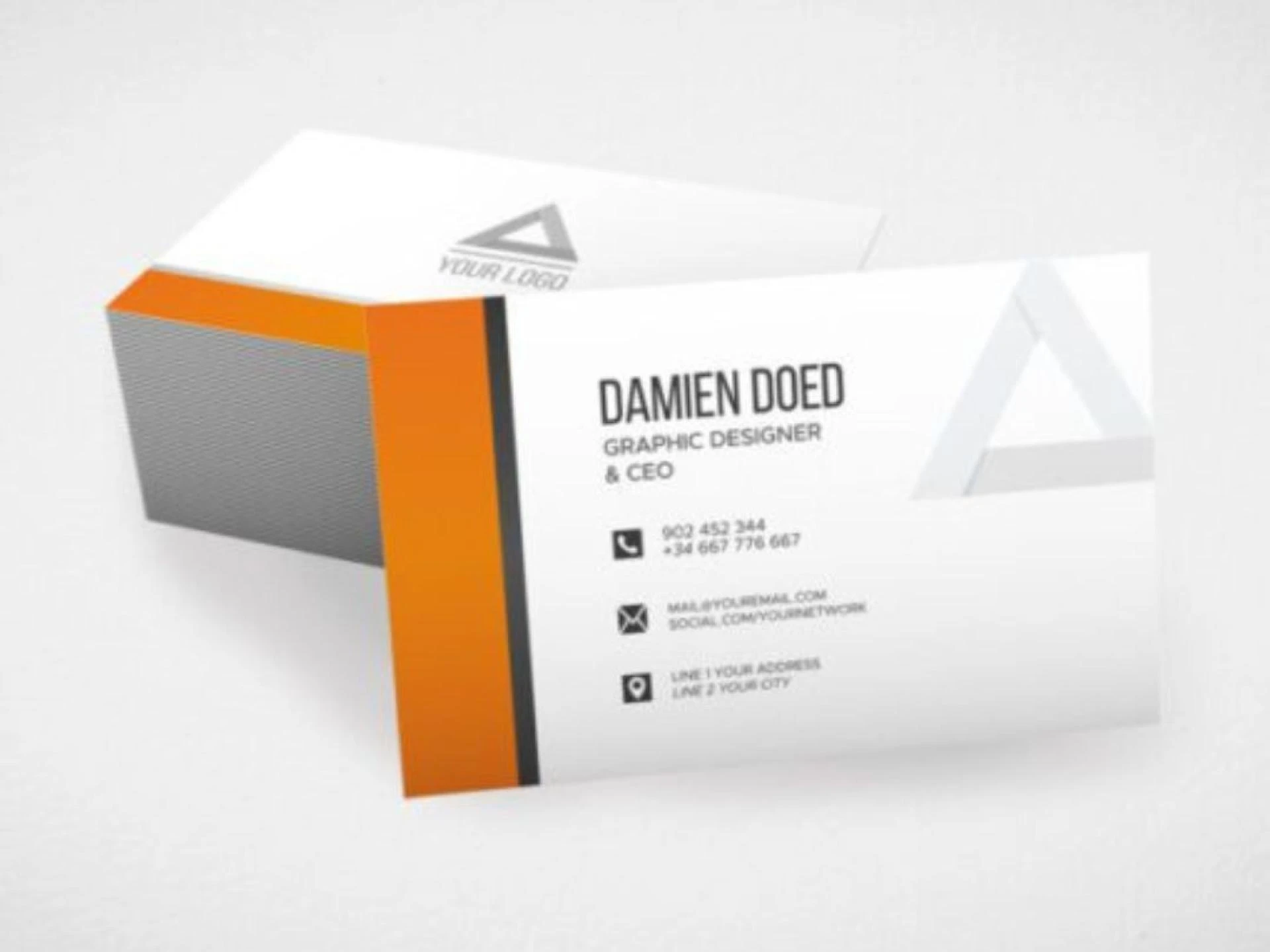
Essential Information to Include
Every card must clearly communicate who you are and how to reach you—nothing more, nothing less.
Contact and Professional Details
Stick to essential information only.
- Full name and title
- Phone number and email
- Website URL
- Social handles (if applicable and relevant)
Make sure all contact details are accurate and consistently styled.
QR Codes and Digital Integration
QR codes are now widely accepted and convenient.
- Link to your website, booking form, digital portfolio, or vCard.
- Position the code in a clear, uncluttered area—ideally the back of the card.
- Ensure it’s scannable by printing it no smaller than 1cm².
Print Quality and Production Considerations
Even a well-designed card can fall flat with poor print execution.
Choosing a Reputable Printer
Partner with printers who offer quality control, proofs, and customer support.
- Online printers: Offer competitive pricing but require careful file preparation.
- Local printers: Provide more control, proofing samples, and consultations.
Proofing and Quality Checks
Always request a sample or proof before bulk printing.
- Check bleed, trim, and alignment.
- Test colours under natural and artificial light.
- Ensure text is sharp and readable at actual size.
Business Card Trends to Consider
Staying current can give your card visual appeal and relevance.
- Minimalist design: Clean layouts with lots of white space dominate high-end branding.
- Vertical layouts: Especially effective for creative professionals and freelancers.
- Eco-conscious materials: Kraft paper, seeded paper, and recycled stocks reflect sustainability and are gaining popularity.
Common Mistakes to Avoid
Avoid design or print errors that reduce credibility or usability.
- Don’t overload your card with text, graphics, or unnecessary contact options.
- Avoid brand inconsistencies—use only your approved colours, logos, and fonts.
- Never compromise on material or printing quality—it weakens your entire brand image.
Final Words
A thoughtfully crafted business card connects your brand with prospects in a personal, tangible way. It’s more than a printed square—it’s your silent spokesperson. The right choices in design, material, and information help you leave a lasting, professional impression. Whether you’re handing it out at an event or leaving it behind after a meeting, your business card should always speak with purpose and precision.


Sign in to leave a comment.