First impressions in the cutthroat realm of real estate define everything. Since most homebuyers start their search for a house online, excellent images are rather important in drawing in possible buyers and guiding their choice of purchase.
Real estate photography is about creating an emotional narrative that people will relate with, not only about capturing the characteristics of a property. Strategic application of colour psychology in photo editing—which can arouse particular emotions, accentuate architectural details, and leave a lasting impression—is a vital component of this process.
With an emphasis on tools and approaches, this blog investigates how colour psychology affects real estate photo editing decisions, featuring ideas from PixelShouters, a leader in real estate photo editing services.
Appreciating Colour Psychology in Real Estate Photographs
The study of how colours affect human emotions, behaviours, and impressions is known as colour psychology. Colours in real estate photography are not only aesthetic decisions; they are also potent instruments that help to define how prospective purchasers view a property. Studies suggest that colour alone forms up to 90% of a person's first perception of a good or brand.
In the context of real estate, this implies that the emotional reaction and decision-making process of a buyer can be much influenced by the colours in the pictures of a house.
Every colour has particular emotional connotations that could change based on cultural, personal, and situational elements. As in:
- Red suggests urgency, passion, and intensity. Though used sparingly to prevent overwhelming viewers, it's interesting and can emphasis important elements.
- Blue: connected to dependability, peace, and trust. It's perfect for fostering peace in bathrooms or bedrooms.
- Green: Reflects peace, rebirth, and expansion. For outdoor areas or rooms supposed to feel natural and cool, it works well.
- Yellow reminds of warmth, hope, and vitality. It's ideal for living spaces or kitchens to foster friendliness.
- White, grey, beige neutrals capture simplicity, sophistication, and adaptability. For modern architecture or small rooms, they create areas that seem bigger and more open.
Knowing these connections helps editors and photographers to make wise selections during the photo editing process, thereby ensuring that the colours in the images of a property complement the emotional tone they wish to portray.
The Function of Colour in Real Estate Photography
Strategic tool that transcends the arrangement of a property is real estate photography. It's about building an emotional relationship with possible tenants so they might see themselves inhabiting the property. In this procedure, colours are absolutely vital since they:
- Create Spatial Illusions: Lighter colors—such as whites and soft neutrals—reflect more light, thus rendering rooms seem bigger and more open. On the other hand, darker colours could create cosiness but, if overused, they might make areas seem smaller.
- Highlight Features: Strategic colour use can highlight architectural details by increasing contrast or vibrancy, therefore drawing attention to distinctive features as a fireplace or a striking wall.
- Evoke Emotions: Warm colours such as yellows and reds inspire cosiness and hospitality; cool colours such as blues and greens inspire tranquilly and relaxation.
- Ensure Visual Cohesion: A harmonic colour scheme over a sequence of images offers a sense of oneness, therefore enhancing the property's experience of well-designed and carefully chosen.
Leading real estate photo editing company PixelShouters stresses the need of colour correction and grading if one wants these results. Their knowledge of technologies like Adobe Lightroom and Photoshop guarantees that colours are changed to improve the appeal of a property while keeping accuracy and uniformity.
The Science of Real Estate Photographer Colour Correction
A basic feature of real estate photo editing, colour correction guarantees that colours appear accurate, vivid, and consistent over a succession of images. PixelShouters defines colour correction as the process of precisely reflecting the property by varying brightness, contrast, saturation, and hue in images. This procedure calls for knowledge of colour theory and the psychological effects of various colours, therefore combining art and science.
Typical Colour Problems in Real Estate Images
Real estate photographers sometimes run against difficulties including:
- Colour casts are the result of undesired tints brought in by lighting conditions, such bluish tints from fluorescent lights or reddish tones from tungsten lighting.
- Mixed illumination sources—such as artificial and daylight—can produce unequal colour tones over an image.
- Correcting improper exposure can either soften colours or wash them out, therefore lessening the visual impact of the image.
- Lack of Vibrance: Flat or subdued colours could make a place seem unappealing.
PixelShouters solves these problems with cutting-edge editing tools including:
- White balance adjustment: Using tools like Lightroom's eyedropper or manual temperature sliders to neutralise colour casts and get natural-looking colours.
- Balancing brightness: Changing highlights, shadows, and midtones helps one balance brightness and improve colour vibrancy.
- Rising contrast will provide depth and change saturation to make colours pop without looking artificial.
- Selectively changing hue, saturation, and brightness for particular colours will help to highlight important components, such a cosy wooden interior or a rich green grass.
The Function of Colour Grading
Beyond simple corrections, colour grading lets editors produce a certain atmosphere or style. Warm tones, for instance, might make a living room appealing, while cooler tones might accentuate the calm atmosphere of a bedroom. PixelShouters uses colour grading to give photos depth and character, therefore guaranteeing they stick out on internet listings and complement the intended emotional tone of the property.
Using Colour Psychology to Edit Real Estate Photos
Effective application of colour psychology in real estate photo editing requires editors to take into account the target audience of the property, the purpose of every space, and the general aesthetic value. Here is how colour psychology shapes decisions on editing for various environments:
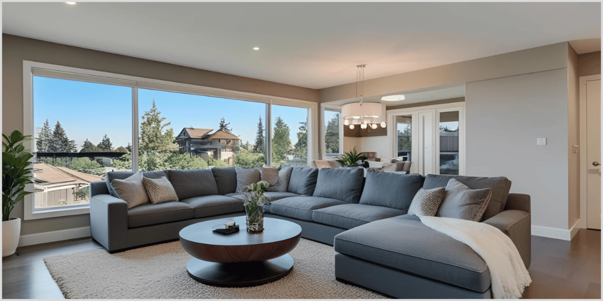
Kitchens and Living Rooms: Warm and Inviting
Buyers seek warmth and connection in communal areas like kitchens and living rooms. Warm colors—soft yellows, soft reds, or warm neutrals—beige, cream—can arouse sentiments of cosiness and hospitality. As in:
- Edit Tip: To create a friendly environment, accent walls or warm tones in wooden furniture should be enhanced. PixelShouters advises modestly raising the saturation of yellows and oranges using Lightroom's HSL panel so as to avoid overwhelming the image.
- For instance, one can edit a kitchen with warm-toned cabinets to highlight golden tones, therefore enhancing the inviting and family-friendly nature of the area.
Bathrooms and Bedrooms: Calm and Serene
Bathrooms and bedrooms are places for rest; cool colours like blues and greens help to establish a peaceful haven. These colours help consumers see a serene haven and are connected with relaxation.
- Edit Tip: Changing white balance will help to highlight cool tones in wall or bedding colours. For a calming effect, PixelShouters advises adjusting blues and greens in Photoshop using its selective colour change.
- For instance, one can edit a master bathroom with marine blue tiles to accentuate the blue tones, therefore producing an Alaskan oasis-like impression, as DMD Real Estate Photography notes.
Outdoor Areas: Natural and Cooling
Green and earthy tones that inspire nature and growth help outdoor spaces including patios and gardens. These hues may make outdoor areas seem energetic and welcoming.
- Edit Tip: Using Lightroom's vibrance tool will help you to improve the green of grass or foliage, therefore preventing oversaturation. PixelShouters stresses the need of natural-looking greens to appeal to consumers looking for a connection with environment.
- For instance, one can modify a backyard with a rich lawn to accentuate vivid greens, therefore presenting it as well-kept and attractive.
Modern Lofts or Urban Properties: Clean and Neutral
Neutral colours such white, grey, and black provide modern or urban homes a smart and flexible appearance. These colours give areas a more modern and expansive impression.
- Edit Tip: Emphasising modern design features and crisp lines, use high-contrast editing. PixelShouters advises changing Lightroom's exposure and contrast to make whites seem crisp and greys sophisticated.
- For instance, one can modify a downtown loft with white walls to improve light, therefore creating a feeling of airy, spaciousness.
Instruments and Methods for Real Estate Photography Colour Editing
PixelShouters emphasis a number of tools and methods necessary for efficient colour modification in real estate photography. These instruments enable editors to keep professionalism and accuracy while reaching the intended psychological impact.
Adobe Lightroom
Real estate photographers turn to Lightroom mostly because of their user-friendly design and non-destructive editing features. Important elements include:
- White Balance Correction: Correct colour casts with the temperature sliders or eye dropper.
- HSL Adjustments: Change particular colours to either accentuate or tone down their strength.
- Preset Application: Apply consistent colour settings over a run of photographs to create a coherent effect.
- Batch Editing: To save time, batch editing—process several photos at once—helps.
Adobe Photoshop
For more difficult adjustments, Photoshop provides sophisticated colour correcting features. PixelShouters handles chores including:
- Layer-based editing provides exact control over colour changes without compromising the source image.
- Content-aware fill removes undesired items without sacrificing colour consistency.
- Selective colour adjustments fine-tunes particular colours to accentuate architectural details.
Capture One
Professionals also highly value Capture One for its sophisticated colour grading features. Key benefits for real estate photography, PixelShouters claims, are its simple UI and customisable colour profiles.
Inverters of Colours
PixelShouters also investigates creative ideas like improving visual appeal with picture colour inverters. By means of a strong contrast, inverting colours can accentuate particular elements, such a swimming pool or garden. This method works especially well for developing distinctive visual designs that set listings apart.
Personal and Cultural Aspects of Colour Selection
Though colour psychology offers general rules, cultural and personal elements can affect how colours are seen. As such:
- Cultural Differences: White represents purity and cleanliness in Western civilisations, while in some Eastern civilisations it is linked with grief.
- Personal Experiences: A buyer's reaction to a colour might be influenced by personal experiences like a taste for blue because of favourable childhood memories.
- Gender Variations: Gender variations could also be important; men enjoy stronger colours whereas women frequently prefer softer ones like purple.
When editing images, real estate photographers have to think through the intended audience. A family-oriented house might profit from warm, inviting colours, for example, yet a luxury property might call for elegant neutrals. PixelShouters recommends looking at the demographic of possible purchasers to match colour selections.
Advice for Using Colour Psychology in Photo Editing Practically
Consider the following advice to best utilise colour psychology in real estate photo editing:
- Know the Purpose: Know the purpose of the property; match colour selections to the intended use (e.g., vivid yellows for kitchens, soothing blues for bedrooms).
- Consistency is Key: Presets or batch editing will help to guarantee a consistent colour palette across all photos, so presenting a professional and coherent appearance.
- Avoid Overdoing: Steer clear of overdoing things; authenticity depends on small tweaks. Images seem surreal and purchasers may be discouraged by too saturated colours.
- Cross-Device Testing: Review altered photographs on several screens to guarantee colour fidelity since different devices may show colours differently.
- Outsource to Experts: Hiring experts like PixelShouters to handle high-volume projects will save time and guarantee excellent output. Their staff produces consistent and appealing photographs by specialising in colour correction specifically for real estate photography.
Case Study: Approach of PixelShouters towards Colour Editing
With an emphasis on colour psychology, PixelShouters has developed a name for providing excellent real estate photo editing services. For one assignment, they altered a set of images for a suburban family house. Making the property seem friendly and inviting will help to attract young couples. Their method comprised:
- Improving Warm Tones: To create a comfortable living room and kitchen, they raised the yellows and orange saturation.
- Neutralising Colour Casts: Using Lightroom's white balance features, they neutralised reddish tints from inside lighting thereby guaranteeing correct colours.
- Enhancing Greens: Emphasising the external attractiveness of the property, they improved the green of the backyard grass in line with the psychological link of green with development and rejuvenation.
- Applying Custom Presets: Applying custom presets guaranteed all photographs had a consistent colour palette, therefore producing a polished and professional listing.
The outcome was a collection of pictures that not only highlighted the characteristics of the home but also stirred good feelings, therefore raising buyer interest and accelerating selling.
The Prospect of Colour Psychology for Real Estate Photography
The function of colour psychology in real estate photography probably will change as technology develops. Emerging trends consist in:
- AI-Based Editing Tools: By automatically adjusting colours depending on psychological concepts, AI-powered software simplifies editing.
- Virtual Staging Tools: Virtual staging tools let editors play about with several colour schemes to find which appeals most to purchasers.
- Data Analytics: Data analytics helps editors to customise colour selections to particular buyer groups, hence improving personalisation.
Leading in these developments is PixelShouters, which uses virtual staging and AI-based technologies into their process to produce fresh ideas.
Ultimately
In real estate photo editing, colour psychology is a useful tool that shapes the impression and connection that possible purchasers have with a home. Understanding the emotional effect of colours and using deliberate editing techniques will help photographers and editors produce photographs that highlight important elements, generate the intended atmosphere, and increase customer attention.
The knowledge of colour correction and grading of PixelShouters shows how professional editing can improve real estate photographs to unprecedented levels, thereby guaranteeing homes stand out in a competitive market. The careful application of colour psychology may make all the difference in transforming a listing into a sold home, whether that means stressing cold colours for a calm bedroom, improving warm tones for a cosy living area, or establishing a consistent colour palette.
Working with experts like PixelShouters will save time and produce amazing outcomes for real estate firms wishing to use colour psychology. Their combination of technical knowledge with a grasp of human emotions helps produce images that not only highlight the beauty of a property but also appeal to purchasers by means of an engaging narrative.


Sign in to leave a comment.