I’ve often wondered why some sites feel like home while others feel like a digital maze.
Usually, the answer is not the homepage. Not the colour palette. Not even the product itself. It’s the front door. The login box. The first request the platform makes of you. In a web economy shaped by speed, habit, and very thin patience, that moment carries absurd weight.
Look back a decade ago, and people were more forgiving. A clunky sign-in form was annoying, sure, but it rarely felt fatal. Today it absolutely can be. We live in an era of hyper-efficiency. If a login screen hesitates, asks for too much, or looks even slightly confused, users start pulling away before the relationship has begun.
That is the silent power of frictionless access. When it works, nobody praises it. They just stay. They move forward. They trust the system a little more. When it fails, the damage is instant.
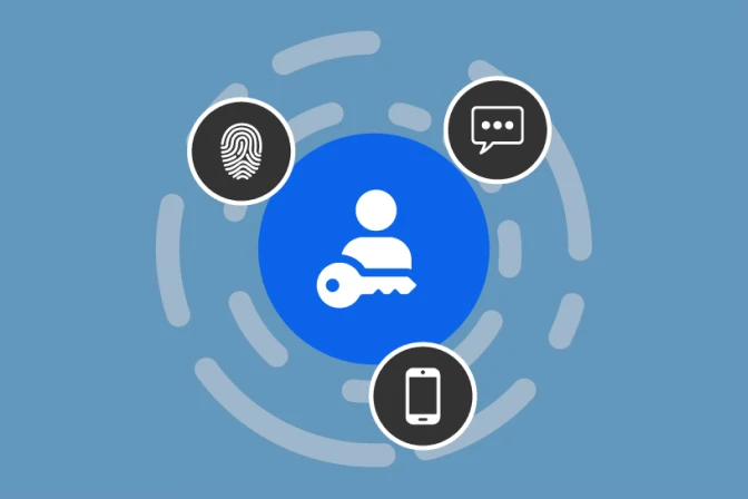
The login portal is the real first impression
People like to say the homepage is the storefront. I disagree. The login portal is the real test. It is where promise meets behaviour.
A landing page can flatter you with polished graphics and ambitious copy. The sign-in flow cannot hide. It has to prove that the product understands your time, your attention, and your anxiety. Because let’s be honest—logging in is not a neutral action. It creates tension. You are handing over credentials. You are hoping the site remembers you. You are waiting for confirmation that you still belong there.
If the experience is smooth, that tension disappears almost immediately. If it is awkward, the cognitive load spikes. Suddenly the user is not thinking about the value of the platform. They are thinking about whether they mistyped something, whether they forgot a password, whether the page is broken, whether this is going to turn into a five-minute detour they did not sign up for.
That small emotional shift matters more than most companies admit.
Digital friction is often invisible until it becomes fatal
The strangest thing about digital friction is that teams can normalise it internally. They know the flow. They know why the extra field is there. They know why the security step appears in a certain order. The user, meanwhile, knows none of that. The user only feels drag.
One extra click. One unclear error state. One loading pause without feedback. One OTP message that takes too long. One reset-password loop that sends them into a second tab and then back again. None of these things sound dramatic in isolation. Together, they create churn.
This brings us to the core of the problem: the best authentication systems remove effort without removing confidence.
That sounds simple. It isn’t.
A fast login that feels unsafe is useless. A secure login that feels exhausting is nearly as bad. The real work of modern UX lies in making those two things stop behaving like enemies.
Less form, more flow
Good login design is a lesson in restraint.
The user should not have to interpret the interface. The next action should feel obvious. The input fields should be minimal. The recovery path should be visible without being aggressive. Error messages should be calm and specific. The whole journey should feel like a guided corridor, not a bureaucratic obstacle course.
That is why the best login experiences often look almost boring. Clean spacing. Very little text. Few decisions. No visual drama. But that “boring” surface usually hides a lot of design maturity. Somebody has worked hard to remove choices, tighten timing, and stop the interface from making the user think harder than necessary.
But here’s where it gets interesting: the future of login UX is no longer just about simplification. It is about simplification backed by stronger architecture.
The FIDO Alliance describes passkeys as phishing-resistant, passwordless credentials that improve user experience by letting people sign in with the same biometrics, PIN, or device unlock method they already use every day. FIDO also says passkeys can cut sign-in time sharply, with consumer sign-ins reported as up to 75% faster and 20% more successful than passwords or passwords plus a second factor.
That is a major shift. It means “seamless authentication” is no longer a nice design ambition. It is increasingly a technical standard.
Security and convenience are finally starting to cooperate
For years, the industry treated security and convenience like two children who had to be kept in separate rooms. If you wanted stronger protection, you made users do more. More codes. More steps. More interruptions. More proof that they were who they claimed to be.
The problem is obvious. Every extra step adds friction. And friction kills momentum.
Today, that balance is changing. Microsoft’s passkey guidance describes passkeys as both simple and fast, while also emphasising protection against phishing. FIDO says the same thing from the standards side: passkeys replace passwords with cryptographic key pairs, reducing phishing risk and credential reuse while improving usability.
That matters because it changes the whole philosophy of digital access. Instead of forcing users to choose between safety and speed, modern authentication systems can increasingly offer both. Not perfectly. Not everywhere. But the direction is clear.
For developers and product teams studying how high-performance portals turn complex security logic into a lighter user journey, you can check here to observe how a streamlined login interface can sharpen that first-touch experience. The wider lesson is not about any single platform category. It is about how user-centric architecture reduces visible friction while keeping the pathway structured and coherent.
Why the first few seconds decide everything
There is a hard truth in digital product design: users do not separate access from product quality.
They may say they do. They may tell themselves they are evaluating the service as a whole. But emotionally, the login experience bleeds into everything that follows. If the sign-in process feels elegant, the platform feels more competent. If it feels slow or unstable, the entire product inherits that doubt.
This is why form design matters so much. Google’s web.dev guidance repeatedly frames form friction as a conversion and abandonment problem. It notes that smooth autofill experiences can increase conversions, speed up submissions, reduce abandonment, and improve satisfaction. It also encourages developers to collect only the data they actually need, both to reduce friction and to lower privacy risk.
That advice applies far beyond commerce. The same logic holds for sign-ins. Ask for less. Clarify more. Remove surprises. Make the system behave like it was designed for a human being with a life, not a compliance spreadsheet.
The psychology of “it just works”
When login works well, it creates a subtle but powerful feeling: relief.
You tap. The interface responds. You authenticate. You are in. No drama. No confusion. No need to reorient yourself or second-guess what just happened.
That feeling is not trivial. It is the foundation of trust.
Users return to products that feel stable under pressure. They return to systems that know how to disappear at the right moment. This is one of the paradoxes of great UX: the more elegant the access layer, the less visible it becomes. The technology does not ask to be admired. It simply gets out of the way.
And in many cases, that invisibility is the product’s greatest strength.
Because what is the ideal login, really? It is not one that dazzles. It is one that feels natural enough that the user barely notices the threshold at all.
Why frictionless access is now a growth strategy
Marketers often talk about retention as if it begins after activation. In reality, retention begins at the threshold. The login is not an administrative step. It is part of the product experience, part of the brand, and part of the business model.
A smoother login can reduce abandonment. It can shorten time-to-value. It can lower support burden. It can reduce password-reset chaos. It can make a product feel more premium without changing anything else on the page.
FIDO’s implementation materials go even further, arguing that passkey-based sign-ins can improve service delivery, lower costs, and increase productivity because they speed up authentication while reducing phishing risk and credential reuse.
That is why authentication is no longer a back-office technical detail. It is a growth surface.
The invisible future
The future of digital hubs will belong to platforms that make entry feel natural.
Not careless. Not loose. Natural.
That means fewer passwords where possible. Smarter device-based trust. Better fallback paths. Cleaner error handling. Less visual noise. Less user confusion. More confidence without more ceremony.
We are heading toward a world where the best access systems will feel almost silent. You will not admire them because they will not interrupt you long enough to demand admiration. You will simply move through them.
And that is exactly the point.
The most important technology in the next phase of the internet may not be the loudest, the most branded, or the most theatrical. It may be the one that quietly removes itself from the user’s way.
A great login does not announce its brilliance.
It lets you in, and lets the rest of the experience begin.


Sign in to leave a comment.