In the visually saturated world of digital marketing, a banner is often your first impression, a silent salesperson, and a critical call to action. But even the most compelling copy or a stunning image can fall flat if it's trapped within an ill-fitting frame. The unsung hero in this visual symphony? Banner aspect ratio. It’s more than just a technical specification; it's the foundation upon which your design's impact is built, influencing everything from readability to brand perception.
Think of it this way: you wouldn't try to fit a square peg into a round hole, would you? Yet, countless businesses inadvertently do just that with their digital banners, forcing beautiful creatives into distorted dimensions. The result is a fractured message, a missed opportunity, and ultimately, a poorer return on investment.
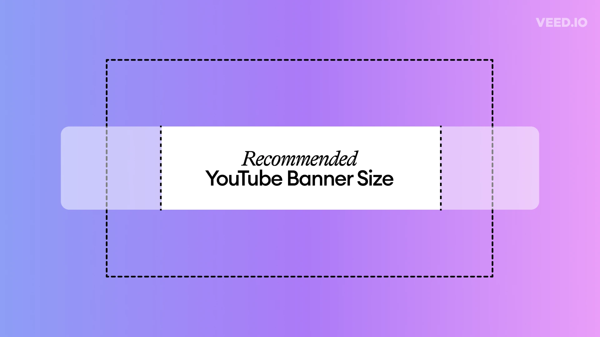
So, what exactly is banner aspect ratio? Simply put, it's the proportional relationship between the width and the height of a banner. It’s expressed as two numbers separated by a colon, like 16:9 or 1:1. The first number represents the width, and the second represents the height. Understanding and strategically utilizing these ratios is paramount for any digital marketer, designer, or business owner looking to make a splash online.
Why is this seemingly technical detail so crucial?
1. Visual Harmony and Aesthetics: Our brains are wired for balance and proportion. When a banner's aspect ratio is off, it creates a sense of unease, even if we can't consciously articulate why. An image stretched or squashed looks unprofessional and detracts from your message. A well-chosen aspect ratio ensures your visuals are presented as intended, creating a harmonious and aesthetically pleasing experience for the viewer. This subtle visual harmony builds trust and reinforces your brand's commitment to quality.
2. Readability and Message Clarity: Text on a banner needs room to breathe. If your aspect ratio forces your copy to be crammed into a narrow space or stretched across an unnaturally wide one, readability suffers. Crucial headlines might be cut off, or body text could become illegible. The right banner aspect ratio provides the optimal canvas for your text, ensuring your message is delivered clearly and effectively. This is especially vital for call-action buttons and key information that needs to be instantly digestible.
3. Platform Compatibility and Reach: This is where the rubber meets the road. Different digital platforms – be it Google Ads, social media channels like Facebook, Instagram, LinkedIn, or even specific website ad slots – have their own preferred or required banner aspect ratios. Attempting to force a 16:9 banner into a 1:1 Instagram story slot will result in awkward cropping or unsightly blank spaces. Ignoring these specifications limits your reach and can even lead to your ads being rejected. By understanding and designing for various standard ratios, you ensure your campaigns can seamlessly transition across platforms, maximizing your visibility and potential audience.
4. Optimized User Experience (UX): A well-proportioned banner contributes significantly to a positive user experience. When banners fit naturally within the layout of a webpage or app, they don't disrupt the user's flow or create visual clutter. This seamless integration makes your ads feel less intrusive and more like a natural part of the content, leading to higher engagement rates and a more favorable brand perception.
5. Brand Consistency: A consistent brand identity is built on a multitude of factors, and visual presentation is a major one. By adhering to specific banner aspect ratio guidelines across all your digital assets, you reinforce your brand's visual language. This consistency fosters recognition and builds a strong, memorable brand image in the minds of your audience.
Common Banner Aspect Ratios to Master:
While the landscape of digital advertising is constantly evolving, several aspect ratios have become industry standards:
- 16:9 (Widescreen): The ubiquitous standard for video and many display ads. Ideal for showcasing panoramic imagery or content designed for a cinematic feel.
- 1:1 (Square): Dominant on social media platforms like Instagram, making it perfect for feed posts and product showcases. Its balanced nature makes it highly versatile.
- 4:5 (Vertical/Portrait): Increasingly popular on mobile platforms, especially for social media stories and vertical video content. This ratio takes up more screen real estate on mobile devices, capturing attention effectively.
- 2:1 (Horizontal Panorama): Often used for header banners on websites or certain display ad networks, offering a wide, impactful visual space.
- 9:16 (Tall Vertical/Story Format): The go-to for Instagram and Facebook Stories, designed for full-screen mobile viewing.
Pro-Tips for Mastering Banner Aspect Ratio:
- Research Platform Requirements: Before you even start designing, research the specific aspect ratio requirements for each platform where your banner will be displayed.
- Design with Flexibility in Mind: Create your core design elements in a way that allows for easy adaptation to different aspect ratios. Think about placing key information centrally.
- Prioritize Visual Hierarchy: Ensure that even when cropping or resizing for different ratios, your most important visual elements and text remain prominent and legible.
- Test, Test, Test: Always preview your banners on various devices and platforms to ensure they display correctly and maintain their visual integrity.
- Utilize Design Tools: Modern design software often includes features that allow you to easily create and preview designs across multiple aspect ratios, streamlining your workflow.
In conclusion, banner aspect ratio might seem like a minor detail, but its impact on the effectiveness of your digital campaigns is profound. By understanding its significance, adhering to platform specifications, and designing with flexibility in mind, you can elevate your visual communications from mere images to powerful, perfectly framed messages that resonate with your audience and drive tangible results. Don't let an oversight in ratio undermine your marketing efforts; embrace the golden rules of proportion and watch your banners shine.


Sign in to leave a comment.